Better sorting of metrics - more specific data/better visuals

For us it´s important to show data to our clients in the most easy to understand way possible. Client´s dont want endless sorting options, and they want a clear visual style. We find the data selection for the dashboards to be a bit overwhelming for clients to use, and even for us at times. What we would like to have, as we have done in our Google Looker Studio reports:
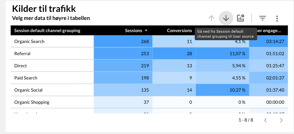
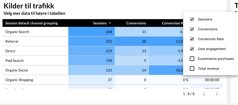
A way to change between primary data/statistics - like in these images where you can dive down from session channel, to source and to campaign - in the same table, so that one can get a better picture of certain things. And also choose specific pre-defined columns, so that the values/data is easy for clients to understand.
Another thing is the visual presentation of the data, with the most important data being highlighted by color/"heat" - so that one instantly can identify the important numbers, and not spend too much time scanning through all tables and rows manually.
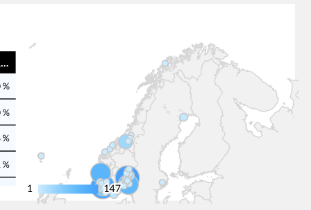
I also miss certain modules from Looker studio, like the map feature where you quickly can identify your main geological areas of traffic.
-
Official comment

First and foremost, thanks for the feedback.
We would just like to clearify a couple of things, so we are certain we understand what you're looking for:A way to change between primary data/statistics
You would like to be able to pre-define which metrics the user can select to see in the table, and give the viewer/user of the dashboard the option to remove/add metrics to the table, but only within the pre-selected metrics?
When you say "dive down" from X to Y, do you mean that you can change the dimension from e.g. <source> to <medium>, or are you referring to the dimensions broken down into sub-segments of the dimension?Another thing is the visual presentation of the data, with the most important data being highlighted by color/"heat" - so that one instantly can identify the important numbers, and not spend too much time scanning through all tables and rows manually.
This is great feedback, and something we can look into adding to our backlog sooner rather than later. Based on the screenshot, it seems like the highlight is per metric. Would it also be relevant for you to have the option to switch to highlighting across all metrics, and not only per metric/column?
I also miss certain modules from Looker studio, like the map feature where you quickly can identify your main geological areas of traffic.
Thanks for this! This is actually something we have planned to include as a widget once we have more segmentation options within the platform. We're planning to include more segments for both ad performance and organic social media – e.g. demographics like age, gender, location. This is planned for Q1 2026 :)
All the best,
Joe -
Hello again,
Thanks for getting back to me, and sorry for my late reply.
1) Yes - we want stricter control on which metrics the client can see/explore, as most clients have NO idea what 90% of it means anyway. So giving them too many options gets overwhelming for them, and they end up not looking at anything at all. This is the most common feedback we hear from clients when we ask them what they think of their reports or why they don´t look at reports. There are too much data. So by restricting to certain metrics, as well as clear color-coding (or similar) - the clients feel more in control and have a better understanding of the data he/she is looking at.
Change the dimensions from “source > medium > campaign” gives an overview of the big picture (organic, paid, referrals, etc) to medium picture (google, bing, newsletter, etc), to details (campaign name, specific campaign or channels, etc).
I like to live by the KISS principle - “Keep It Simple Stupid”.
2) Yes, that would be great :) Just as long as it makes sense and makes the data easily digestible.
3) Glad to hear :)
Feel free to explore one of our reports (a client that is about to shut down his business):
0
Please sign in to leave a comment.
Comments
2 comments